Holm Interior Concepts

NEW STORE GRAPHIC DESIGN

Through the new graphic concept many of the old, as well as the newly opened, stores has gotten a significant facelift - both instore and on the various store fronts.

The graphic concept is empahzing the values of Sportmaster and giving new and attracting life to the brand in the shopping malls and on the high streets.

 
IMG_3697_MH2.jpg

KEY VISUALS

3D VISUALIZATION


STORE LAUNCH / IMPLEMENTATION

IMG_0442_MH_low.jpg
 
IMG_3836.JPG
IMG_4252_MH.jpg


2 NEW CAFÈ CONCEPTs IN “DR BYEN”.


Cheval Blanc Canteens excels in great dining experience for thousands of company employees every day.

Aside from the food menus during the big lunch break, the need for healthy snacks and delicious dining experiences during the daily small breaks has grown and more and more often becomes a substitute for the traditional canteen lunch break. Hence Cheval Blanc saw a need for new cafè concepts.

Together with Holm Interior Concepts and Zob Studio two new cafè concepts was developed - including both interior designs and graphic identities. The world kitchen cafè was named COSMO, and the Italian café POCO.


THE CAFÈS BEFORE.

THE NEW COSMO CAFÈ.

 
COSMO graphics 3.png
COSMO graphics 1.png
COSMO graphics 4.png
 

THE NEW POCO CAFÈ.

POCO 5.png
POCO 2.png
 

VISUALS FROM IDEATION PHASE - COSMO & POCO

Street Food Café_2D_v1_FINAL_R5.png
 
Italian Café_GENEREL KONCEPT v1_POCO_R6_skygge.png
Italian Café_GENEREL KONCEPT v1_POCO_R7b.png


the task.

Create a new store concept to match the zoo values, increase the overall nps rating and add revenue.

key insights.

51% of the 1.3 million yearly guests does not visit the Zoo Shop. The customer satisfaction of the store dragged down the overall experience of Zoo Copenhagen. 

Bad for business - and a huge sales potential wasted.

THE SHOP before.

The front of the old store was neutral and had no stopping power. No wonder that many visitors neither noticed the store or decided to leave without a visit and purchase.

The store interior was rather messy and lacked a clear and consistent concept. Also the staircase, just by the entrance, was disrupting the customer flow and the ground floorpan
which resulted in only 25% visited the first floor.


IDEATION. MOODBOARD & FINAL CONCEPT ROUTE.

Moodbards, setting the conceptual direction. The "Into the Wild" theme was selected and further developed.


3d visualiZATION.

3D visuals of the store - presenting to client team and board members. New concept ideas, such as big screen for digital promotion, 3D printet elephant, path to store from main street, outdoor sales inventory etc.


grand opening NEW SHOP - july 2017

From concept development to complete deployment.

Controlling the full entreprise, from supplier price tenders to production management all the way to implementation was a
crucial part of why the concept reality ended up looking exactly 1:1 like the 3D visuals created during the development process.


Credentials:
Project created as part of iRetail


NEW CONCEPT STORE. FROM IDEATION TO IMPLEMENTATION.
LAUNCHED in MORE THAN 150 NORDIC & NORTH EUROPEAN STORES.

IDEA & CONCEPT • PROTOTYPING • PRODUCTION


THE TASK.

“To redesign the existing store based on existing product fixtures. Main goal to create a prominent, modern and Nordic looking store”


THE PROCESS.

From initial idea to final approved concept in 2 month.


KEY values.

Based on shopper study and brand strategy, the new store concept had to fulfill the below concept key values.


FLOORPLANNING.

Optimizing the store floorplan - creating a better customer journey and operational flow

OLD vs NEW Floorplan.jpg
 

3D VISUALIZATION.

Selected 3D models from the development proces.

THE NEW STORE.

High street in Copenhagen (Købmagergade)

THE OLD AND NEW STORE.

Comparison between the old and the new concept.

NORDIC ROLL-OUT.

Rolled out to more than 150 Nordic stores

 
For more than 4-years Holm Interior Concepts has proven a great understanding of our market challenges,
position and business model, which has been transformed into creative and practical applicable solutions.

The coorporation has included both concept ideas, elements, and more specific instore solutions that also has
had to comply with earlier concept generations.

Holm Interior Concepts are good throughout the entire process from brief over stake holder engagement to final delivery.
An open, honest and pragmatic dialogue has characterized the process.

Also, we highly value the ongoing sparing which does not necessarily result in finished products,
but instead keep us sharp and up to speed.

Final recommendations and conceptual solutions reflect a good understanding of
how to create good long term retail customer experiences.
— TINE BREDVIG, DIRECTOR OF STORE OPERATIONS IN NORTHERN EUROPE
 

new SUPERMARKET CONCEPT

THE OLD STORE

The OLD Kvickly CONCEPT was not planned and designed
to the pleasure and benefit of the shoppers.

The floorplaning was primarily based on the logistics for store staff, making their daily operations easy.

The interior ambience was driven by product and signage pressure, not designed to create a any shopping atmosphere, which generated an alianating, cold and industrial look and feel with thousands of uncontrolled and chaotic visual impressions. Way to much for any human to cope.

No one had ever paid any valid attention to the shopper experience, and the overload of instore stimuli. Nor taking into consideration, that this floorplan in many ways was completely unlogical to the shopper flow and behavior.

And for sure the choices of inventory, materials, colors and lighting did not reinforce the foodappeal and desire to stay longer than necessary.


improvement points

New modern Bakery, in functionality and look and feel.

Convience/ready-to-eat area in bakery

Clothing zone with new flexible fixtures and visual merchandising programme, and improved fitting room

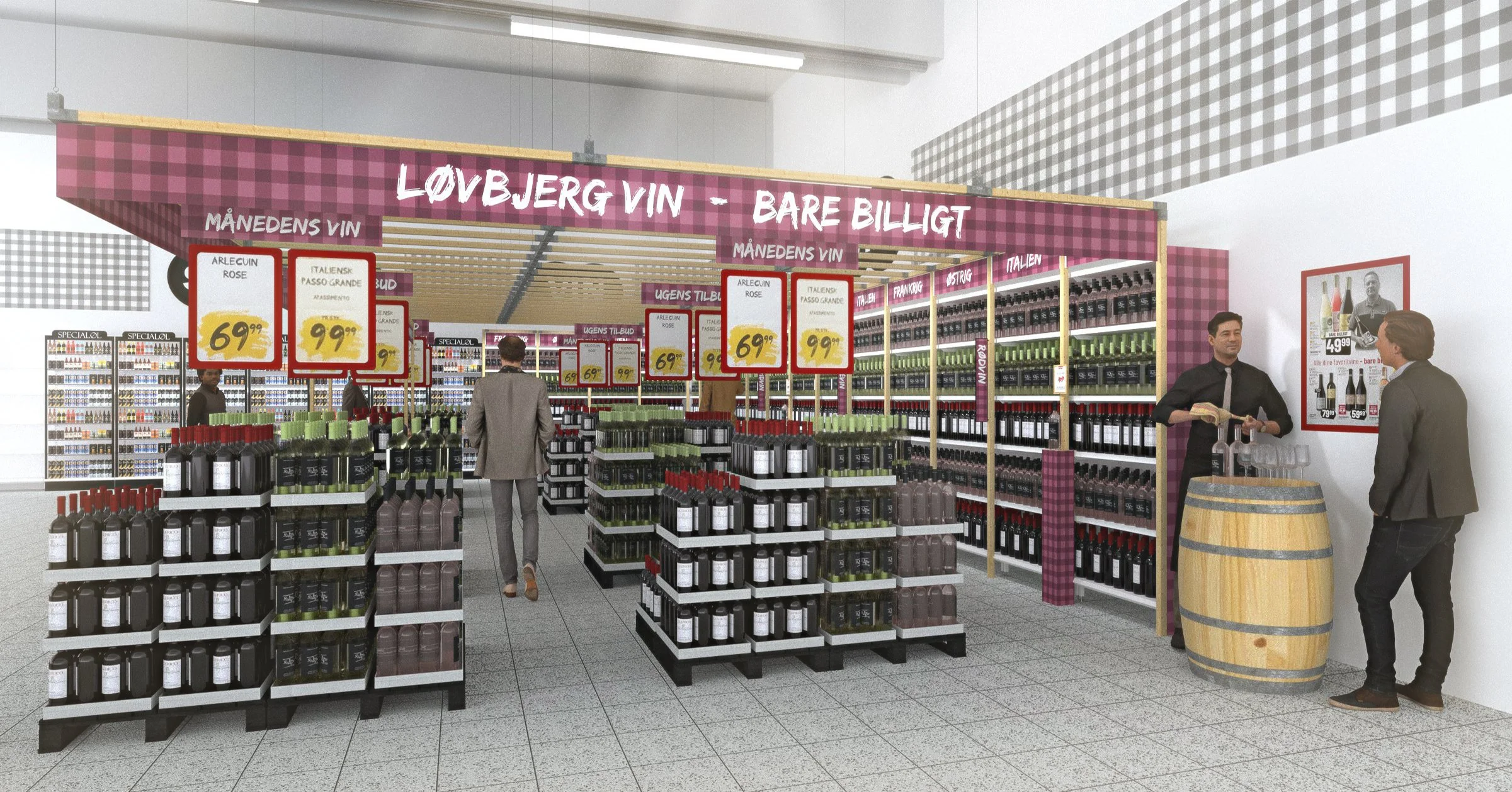
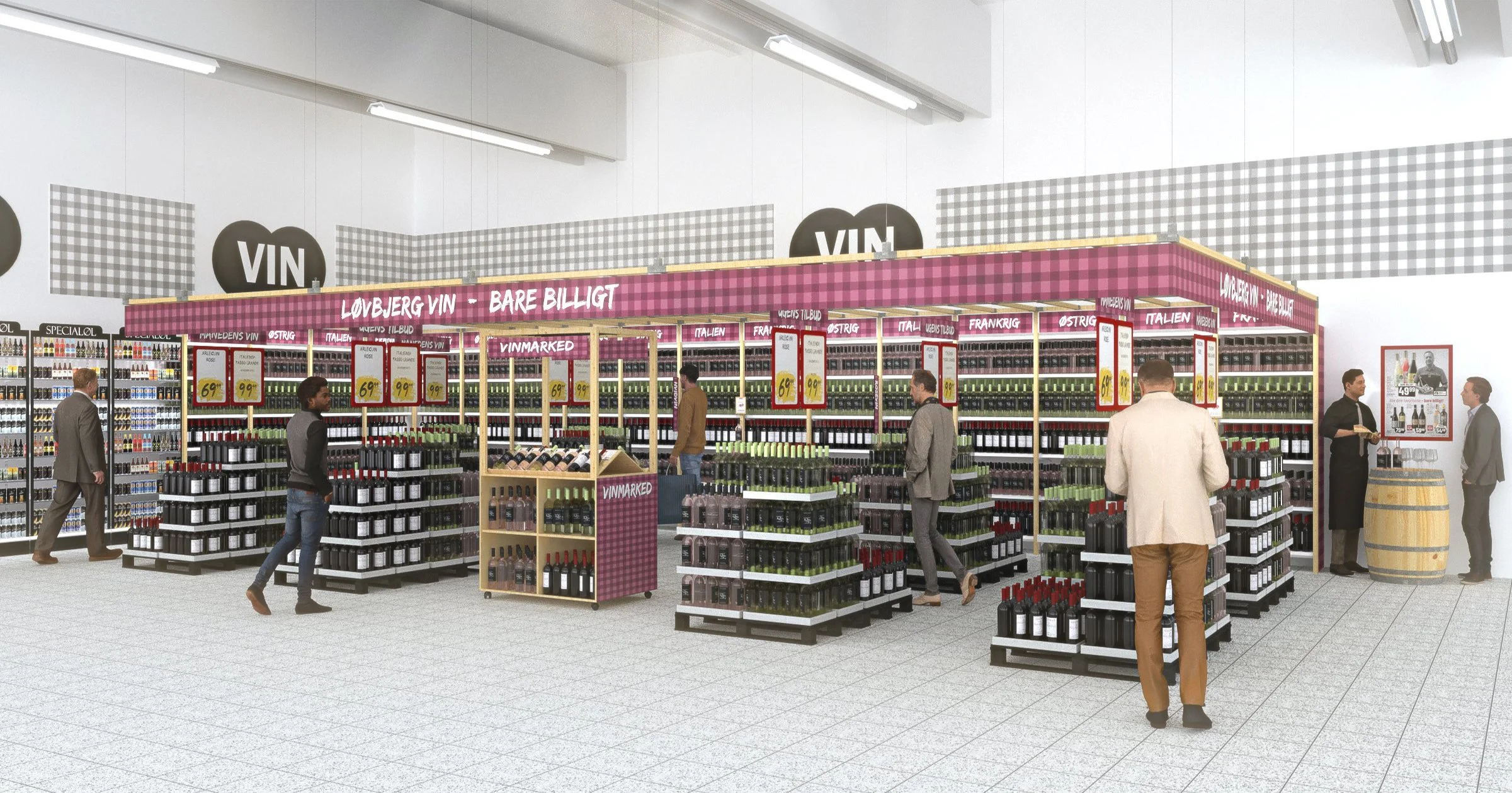
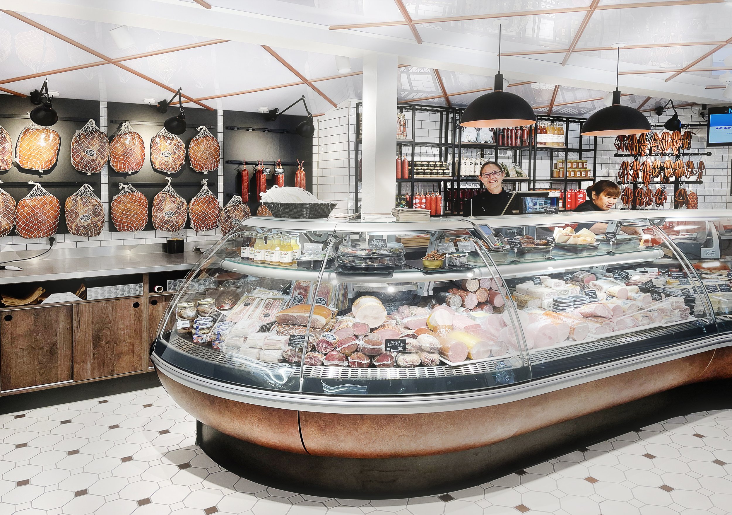
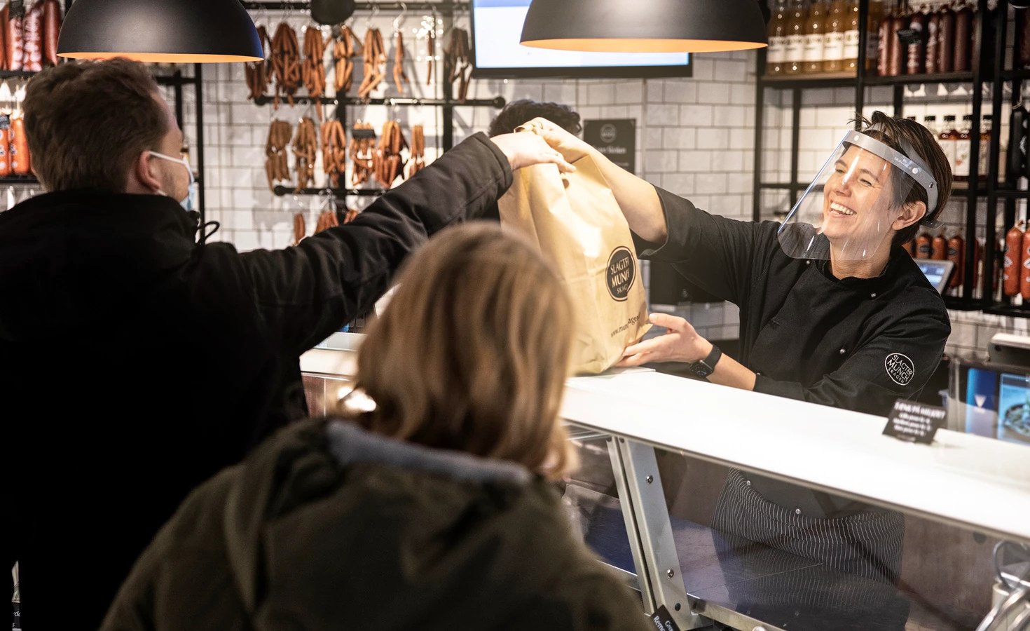
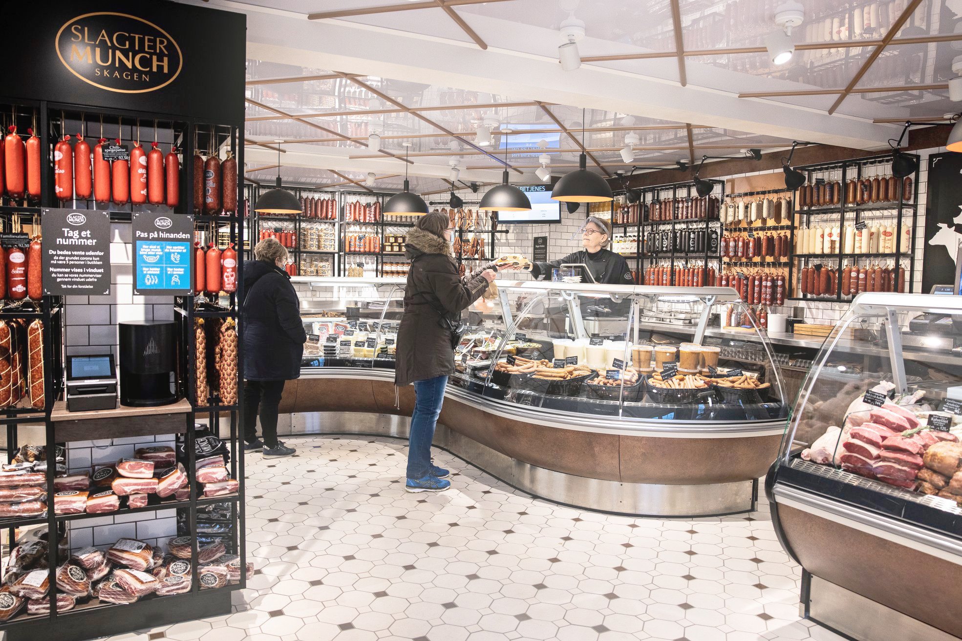
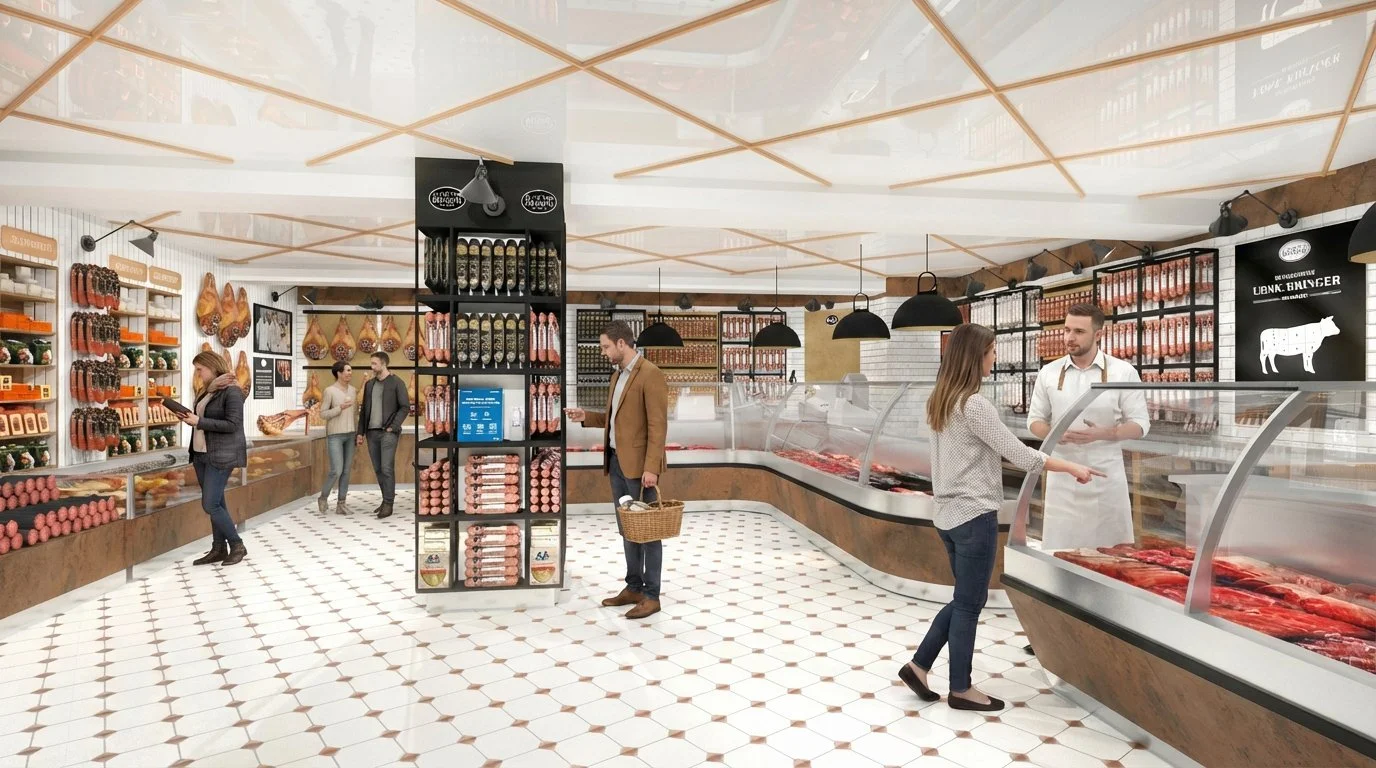
Kvickly Food Marked - fresh fish at the Fishmonger, cooled Fruit & Veg area with staff stand for tastings and advice, Butcher area in floor center to have direct contact with shoppers, improved and enlarged Wine & Spirits area with winebar for tastings and talk.

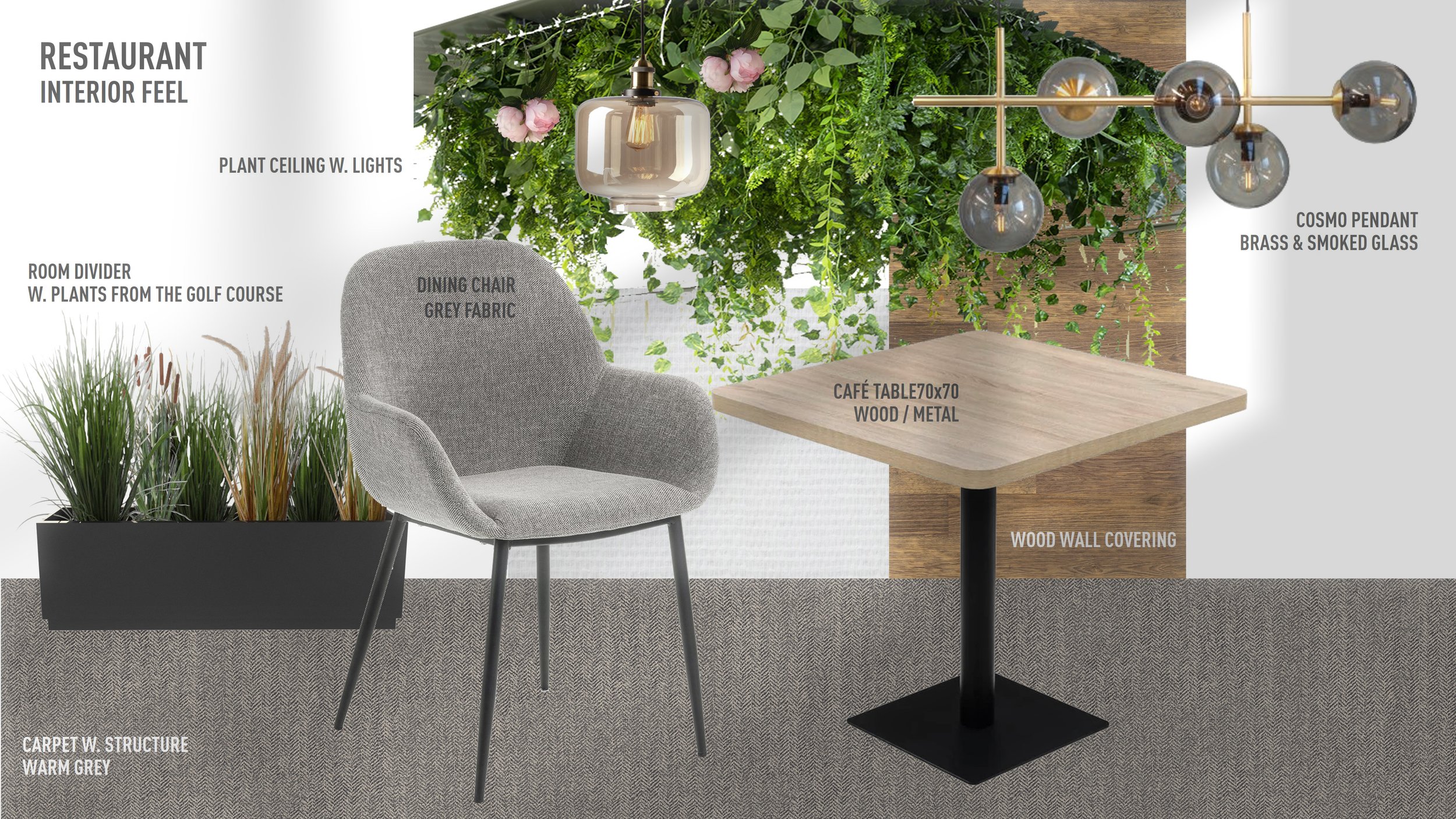
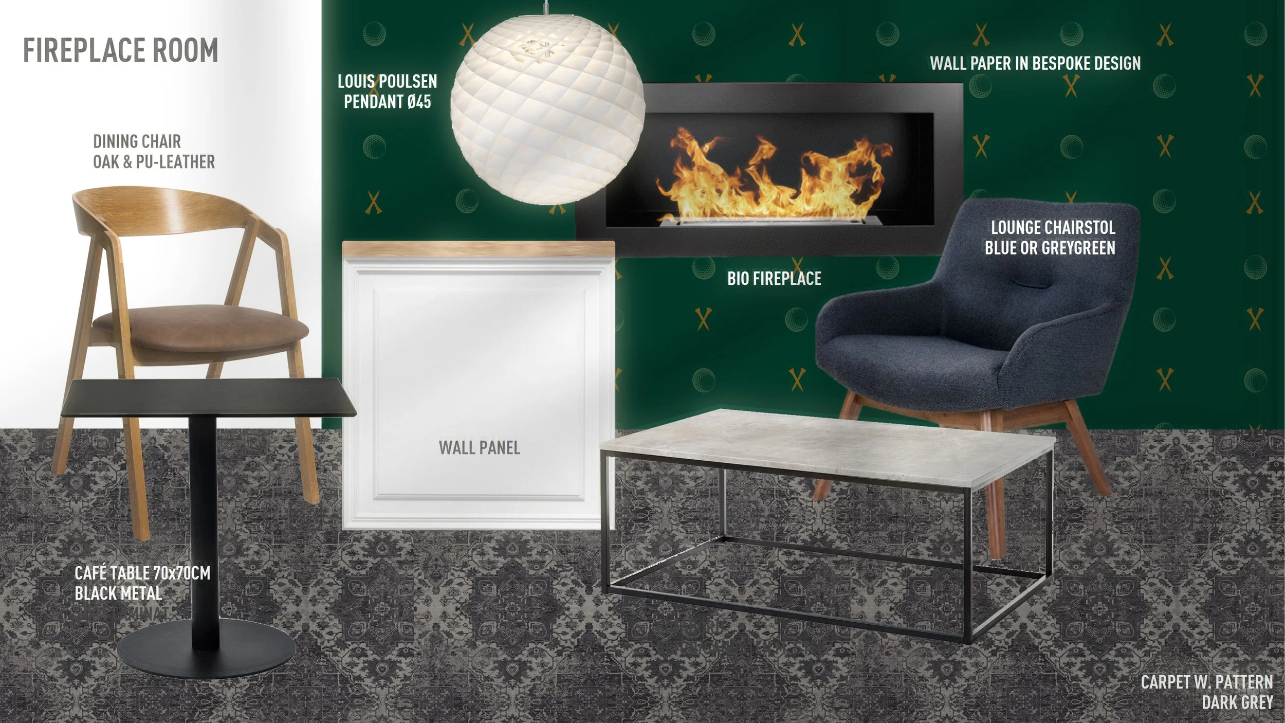
Kvickly's Kitchen - fixed demo area, a wholehearted statement and place for dialogue and tastings for food lovers

Staged and improved Dairy zone

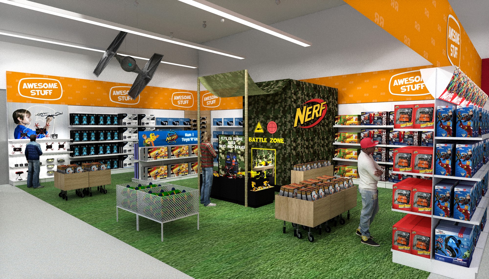
New merchandising principles and fixtures for all Non-food househould products

Men's Zone in personal care area

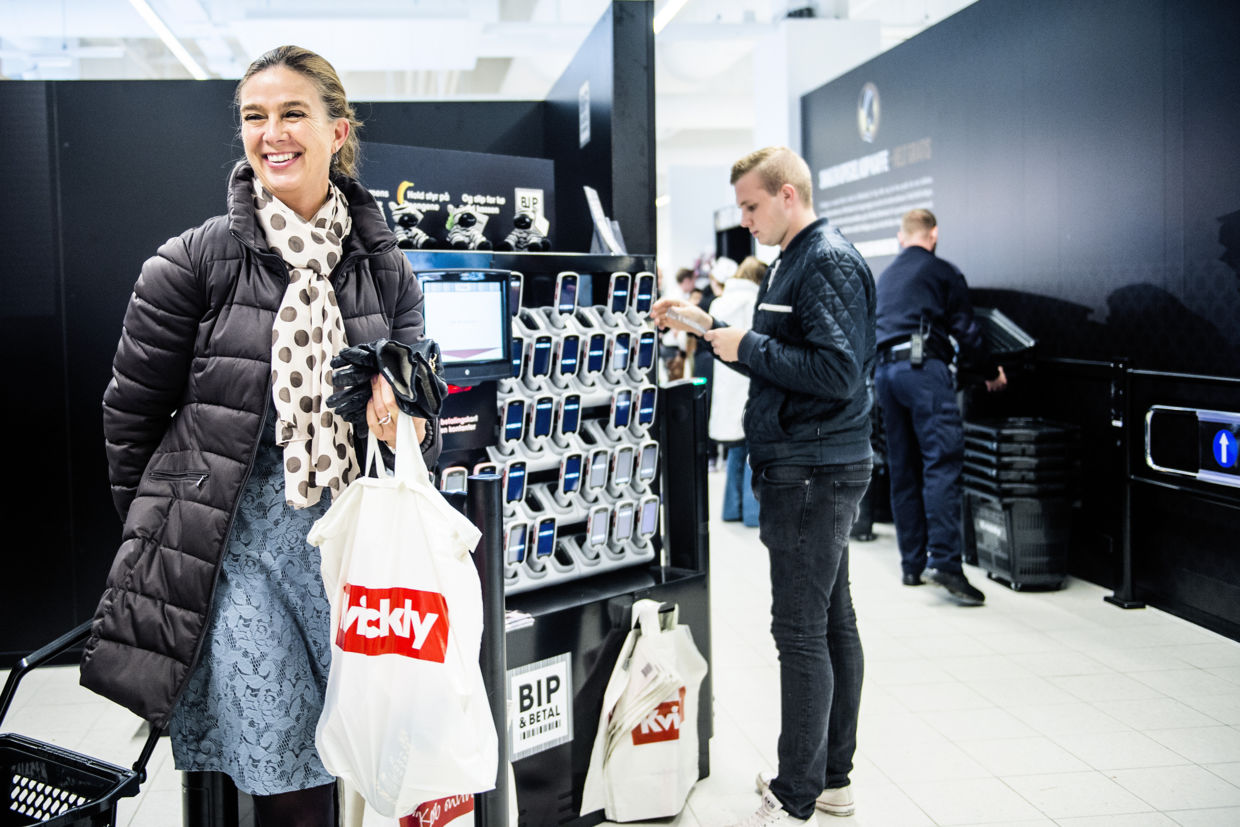
Digital Self-scan via mobile phone or store-device

Free coffee for all shoppers

New comfortable and identity aligned Clothing line for all Kvickly store staff member


THE NEW SUPERMARKET CONCEPT

grand opening - november 2015

Working intensely with the Customer Experience Management and Touch point analysis
generated better understanding of shopper mindset and behavior in general and within each shopping zone.


This knowledge was used in the planning, design and implementation of the overall customer flow and store design, reinforcing food experiences and shopping experiences zone by zone.


is this the supermarket of the future?

Offcourse not, but it's a big leap in the right direction.

the renowned Retail Institute Scandinavia certainly had a positive experience in the new Kvickly.

Read article (in Danish)

 
TRU CASE IMAGE.png


Bring back the magic to the stores, and restore the appeal to the 6-10 year old kids.
— THE CLIENT BRIEF
 

TOMORROW's TOY STORE.


A Toys R Us store has to be a magical and fun place. 
As a toy multi-brand retailer over time the Toys'R'Us concept had faded - and supplier controlled brand shops was dominating the unstructured and somehow chaotic shopper experience.

And the store performance had decreased over time.


new floorplan - From chaos to control.

Working strategically with the customer journey, zone by zone, in coorporation with the client
a new floorplan with zone themes and content was layed out for the test store in Gentofte.

TRU Floorplan.png
 

new zone conceptS - bringing back FUN AND magic

To attract customers back into the store and to appeal to the older kids, each zone was conceptualized and designed to make it fun for the kids and to support the shopper mindset of the parents or adults. Also the graphic identity was brought up-to-date and up-in-age.

 
TRU CVI.jpg

Credentials: 
Graphic Design by Christian Ramsø


THE 'GREAT RIDE' ZONE.

Creating the look and feel of a skater park. Bringing in new concept elements such as an entrance portal, rubber flooring,
skater ramp, parents podium, cool graphics, focal communication points etc.

GREAT RIDE ZONE_Case2_RET2.jpg

THE 'MY ROOM' zone.

Setting the scene - allowing products to be displayed as an actuel boys or girls room, instead of just boxes on shelfs.

My Room.jpg

The 'awesome stuff' zone.

A zone designed for the cool and awesome stuff. Try all the newest products, eg. fly a drone or shoot Nerf guns.

Awesome Stuff.jpg

Credentials:
Project created as part of iRetail

 
ISS CASE IMAGE.png

new CANTINA concept.

A new modern cantina - serving the needs for socialising and meetings.

ISS Catering Service provides professional cantina and catering services to other companies, yet their own cantina far from matched a modern need and feel.

Working with the look and feel through material and color moodboards the new cantina personality and functionality started to emerged. It was important for us to advice ISS that a cantina should embrace modern employee lunch needs, spanning from sitting alone or as a group socialising and taking a break, to holding lunch meetings in small or larger groups.


KJELDSENS CASE IMAGE.png

THE POWER OF 3D

designing 3d spaces via Photoshop 2D muck-ups is never gonna make it

Perspectives will never be right, nor will dimensions be accurate or realistic,
they cannot be viewed from various angles, and can certainly not be used for further production specifications. 


before

Here's a classic Photoshop 2D example - not allowing the right perspectives, costumer view angles and accurate dimensions

Kjeldsens Before2.png
Kjeldsens Before1.png

AFTER

Transforming the pop-up store space into 3D, allowing the concept an all angle perspective, giving an exact impression of the shop elements and surroundings. Especially viewing the shop from the main shopper direction (the escalator) is key to assess the shop layout and sales impact. 

The pop-up shop from another angle in 3D. Various angles allows to design and plan the shop according to the customer flow and sales and communication points.

The pop-up shop from another angle in 3D. Various angles allows to design and plan the shop according to the customer flow and sales and communication points.

3D visual in work. The pop-up seen in proper perspectives, with people and accurate scales.

Front angle. Working in 3D really sets the scene and are the optimal tool to design and discuss the layout before going into production.

Front angle. Working in 3D really sets the scene and are the optimal tool to design and discuss the layout before going into production.

Final angle. The opposite side from first cistomer approach, but the main path to catch customer attention before their exit up the escalotor.

Final angle. The opposite side from first cistomer approach, but the main path to catch customer attention before their exit up the escalotor.

3D visuals as proof of concept

The FORMER store concept was slightly out of date, and not particular consistent and in line with the new brand values.

Hence Letz Sushi started an internal proces to develop and rethink their new store concept.

Before taking any expensive production decisions, 3D visuals from us was used as proof of concept.

Given the accurate floorpan and the choices of materials, colours and furniture the spatial design and the inventory was 3D modelled,

allowing the client a solid base to take the right decisions upon. 


3d RENDERS - AS PROOF OF CONCEPT.


grand opening - letz sushi nordhavn

Going live - September 2017

 
This should be mandatory for all our future
design processes and decisions
— Heidi Østergaard Fleischer, Brand Manager, Letz Sushi
Pillivuyt Case Pic.png


various instore 3d MODELLING.


giving the pillivuyt retail sales pitch more power by actual department store 3d environment,
and creating ideas and guidelines for anniversary pos elements.

GulvDisplay_Stabelbart_Cetti.jpg


Pillivuyt Magasin Shop_3D_NEW-v2.jpg


INSTORE ACTIVATION - CAMPAIGN & PRODUCT EXPO

Together with iRetail and Marvelous we created ideas for activating collective campaigns and ways to emphasize the products even more. Also the customer journey was mapped.

Among the ideas the ‘expo-pole’ was created. A flexible and significant instore element that promotes both campaigns and products.

 
Herlev Butik Banner.jpg


THE EXPO POLE


To create a ‘product hero’ effect an expo pole was developed.
Allowing special product exposure, campaign key visuals and mirrors.


3D MODEL


To support the idea process a 3D muck-up of the Herlev store was created.


Røverkøb case image FINAL.jpg
 

SHOP FRONT POWER

Development of window merchandicing concept and guidelines for the city stores of Røverkøb

 
GmlKongevek Panorama LOW.jpg
Gml-kongevej facade topfriser+mur+kurve LOW.jpg
 

WELCOME TO LYFA PARKEN.
INTERIOR CONCEPT & FURNITURE DESIGN.

Lyfa used to be an old Danish light factory with a fantastic story and heritage. Many great lamps in corporation with designers such as Finn Juhl, Bent Karleby, Piet Hein and many others were made here in the 1950-1970s. Today the building is used as an office hotel and storage facility.

After restoring the entire building Lyfa parken and Lyfa offices desired their own distinct identity and interior atmosphere.

The lobby where visitors arrive and office tenants hang out for breaks, meetings and lunch was a key area, hence the first space to develop and implement the new distinct interior concept.

THE LOBBY BEFORE


IDEATION PROCES

MOODBOARD #1

FLOORPLAN / SEATINGS & WORKZONES INCL. RECEPTION

GRAPHIC DESIGN BY CAMILLA DRAGSTED

MOODBOARD #2

3D FLOORPLAN

CONCEPT SPECIFICATIONS

3D VISUALS


FLY-OVER MOVIE - THE NEW LYFA LOBBY.


THE NEW OFFICE LOBBY


BRAND NEW PET SHOP-IN-SHOP FOR ROYAL CANIN.

CREATING ATTENTION TO THE SPECIAL NEEDS OF KITTENS

With the aim of growing the kitten category by bringing pet owners from grocery store to specialist pet stores, Royal Canin chose us to build an attractive and informative space where the pet owners easily can find all the necessary food and equipment for their kittens.


IDEAS & SKETCHES.


3D RENDERS.


LAUNCH OCTOBER 2020.

First shop implementation in “Satchmos” in Lund, Sweden.

Shop fitting in 4 days & campaign and shop launch in day 5.


LØVBJERG WINE DEPT.


PROJECT.

Idea & concept • Production • Implementation


BRIEF.

Create more atmosphere and sales with simple and cost effective means.


TIME.

Ideation August 2020 / Launch October 2020

LOCATION.

Løvbjerg Fredericia


THE STORE BEFORE.

A classic busy retail category - packed and full of signage, prices and products.

Clearly lacking relevant interior atmosphere and surroundings, to create a more pleasant and focused shopper experience.

Løvbjerg Fredericia Før2.jpg

THE New DESIGN. SKETCHES FROM THE IDEATION PROCES.


THE New DESIGN. 3D RENDERINGS.


Launch October 2020.


NEW KIOSK CONCEPT

A KIOSK WITH A SMILE.

Two former 7-eleven employees wanted their own kiosk. As part of Re-Store we created the ”Jerry’s - A kiosk with a smile” concept. A kiosk that actually looks good, and offers great service and lot’s of food and drink temptations. Handling all phases - from ideation & store concept, naming, graphic identity, furnitures, lighting along to the final shop fit.

 
Jerry's_6.jpg
 

SKETCHES & VISAULS FROM IDEATION PHASE.


NEW SLAGTER MUNCH BUTCHER SHOP.

New shop concept to the famous butcher in Skagen. After 20 years with the same interior design, Slagter Munch and it’s owners Danish Crown, chose Re-Store to ideate and build the new, modern and inviting shop concept.


THE OLD STORE.


IDEA & CONCEPT SKETCHES.


FINAL 3D RENDERS.


GRAND OPENING FEB 2021.

INTERVIEW WITH MARIE MUNCH


NEW GOLF CLUB CONCEPT. RESTAURANT & CAFÉ DESIGN IN KØGE GOLF CLUB.


From a fairly generic and neutral restuarant design - to a unique, homely and personal interior design.

“Home away from home” and inclusion of the surrounding nature was the brief for the creative pitch amoung 3 interior design companies.

KGK chose Holm Interior Concepts as preferred partner - to carry out the design, furniture purchase and in coorporation the implementation phase as well.


THE OLD INTERIOR.

The club house interior expression before, was fairly neutral, grey and generic - clearly lacking an identity and true efforts to make it a comftable and cosy stay for stay for the members and green fee visitors.

THE NEW CONCEPT.

COLOR & MATERIAL FEEL.


Colors extracted from the golf course and its surrounding nature, defined the overall interior color pallette.


3 DIFFERENT ROOMs, 3 different atmospheres.


Understanding the needs and wants of golf players before, during and after the golf round - called for a diverse approach. Not designing the 3 rooms all the same - but instead designing the rooms with different atmospheres for different behaviors and needs.

Hence the large restaurant room was split into two seperate spaces ‘The Restaurant’ and ‘The Fireplace Room’ (no. 2 and 3 below).
Similar ‘The Café’ space (no. 1) was designed for a more relaxed and unformal atmosphere.


FIRST INTERIOR FEEL.


Design and development of the atmosphere in each space. Transforming the overall moodboard to a more concrete interior feel by overlaying furnitures, lamps, tables, chairs, surfaces, decor etc. Including tailormade patterns for carpets and wall paper.


FURNITURES & CONCEPT ELEMENTS.

Specific furniture scheme together with tailormade concept elements.


3D VISUALISATION.


Photo realistict 3D modelling used during the idea and design phase.

LAUNCH - APRIL 2022


NEW HEADQUATER

BUTCHER SHOWROOM & FASTFOOD BAR

As part of RE-STORE, we designed and implemented the interior for both the Butcher Showroom and Fast Food Bar.
The design needed to match the architecture of the new headquarter and showcase the pride of the Danish Crown brand and its products.


3D VISUALS